Warm neutrals are having a major moment in interior design—and for good reason. They're soft, inviting, timeless, and incredibly versatile. Unlike the cooler grays that dominated interiors for years, today's warm neutrals bring a sense of comfort and natural warmth back into the home.
At Modern Bay Painting, we love helping Santa Cruz County homeowners find colors that feel current without becoming dated a few years from now. Whether you're refreshing one room or repainting your entire home, choosing the right neutral can completely transform how your space looks and feels.
What Is a Warm Neutral?
Warm neutrals are subtle shades with warm undertones, including creamy whites, beige, greige, taupe, mushroom, and soft earthy tones.
Some of our favorite examples from Sherwin-Williams include:
- Alabaster (SW 7008) — a soft, creamy off-white that creates a bright but comfortable feel.
- Accessible Beige (SW 7036) — a versatile beige-greige that works beautifully with natural materials and warm finishes.
- Shiitake (SW 9173) — a richer, earthy neutral that adds depth without overwhelming a room.
- Iron Ore (SW 7069) — a deep charcoal that can provide beautiful contrast on doors, cabinetry, fireplaces, and architectural details.
The key isn't simply choosing a beautiful color. It's choosing the color that works beautifully in your home.
1. Consider Your Natural Light
Lighting can dramatically change how paint appears.
A neutral that looks creamy and warm in one home may appear considerably darker—or even slightly gray or green—in another. The direction your windows face, the amount of natural light in the room, surrounding landscaping, and artificial lighting can all influence a paint color.
Before committing to a color, we recommend viewing samples in several areas of the room and checking them at different times throughout the day.
2. Work With the Elements You Already Have
Your paint shouldn't be selected in isolation.
Look at the permanent or expensive-to-replace elements in your space, such as:
- Flooring
- Countertops
- Tile and stone
- Cabinetry
- Fireplace surrounds
- Wood tones
- Large furniture pieces
The best neutral will complement these existing finishes rather than compete with them.
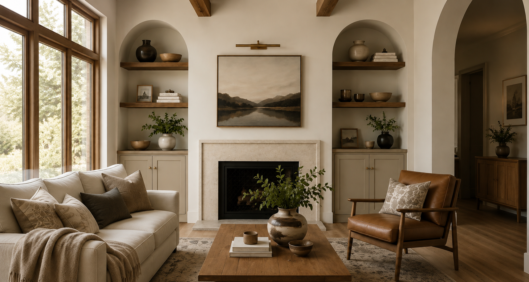
For example, a room with warm oak flooring may look beautiful with a creamy off-white or soft beige, while a space containing cooler stone may benefit from a balanced greige.
3. Pay Attention to Undertones
This is where choosing neutrals can become tricky.
Two beige paint chips may look almost identical in the store but completely different once they're on your walls. One may contain a pink undertone while another leans yellow, green, gray, or taupe.
Those subtle differences become much more noticeable once the color covers an entire room.
That's why professional color selection isn't just about choosing a color you like—it's about understanding how that color interacts with everything surrounding it.
4. Don't Be Afraid of Contrast
A warm neutral palette doesn't mean everything needs to be beige.
In fact, contrast is often what makes a neutral interior feel sophisticated.
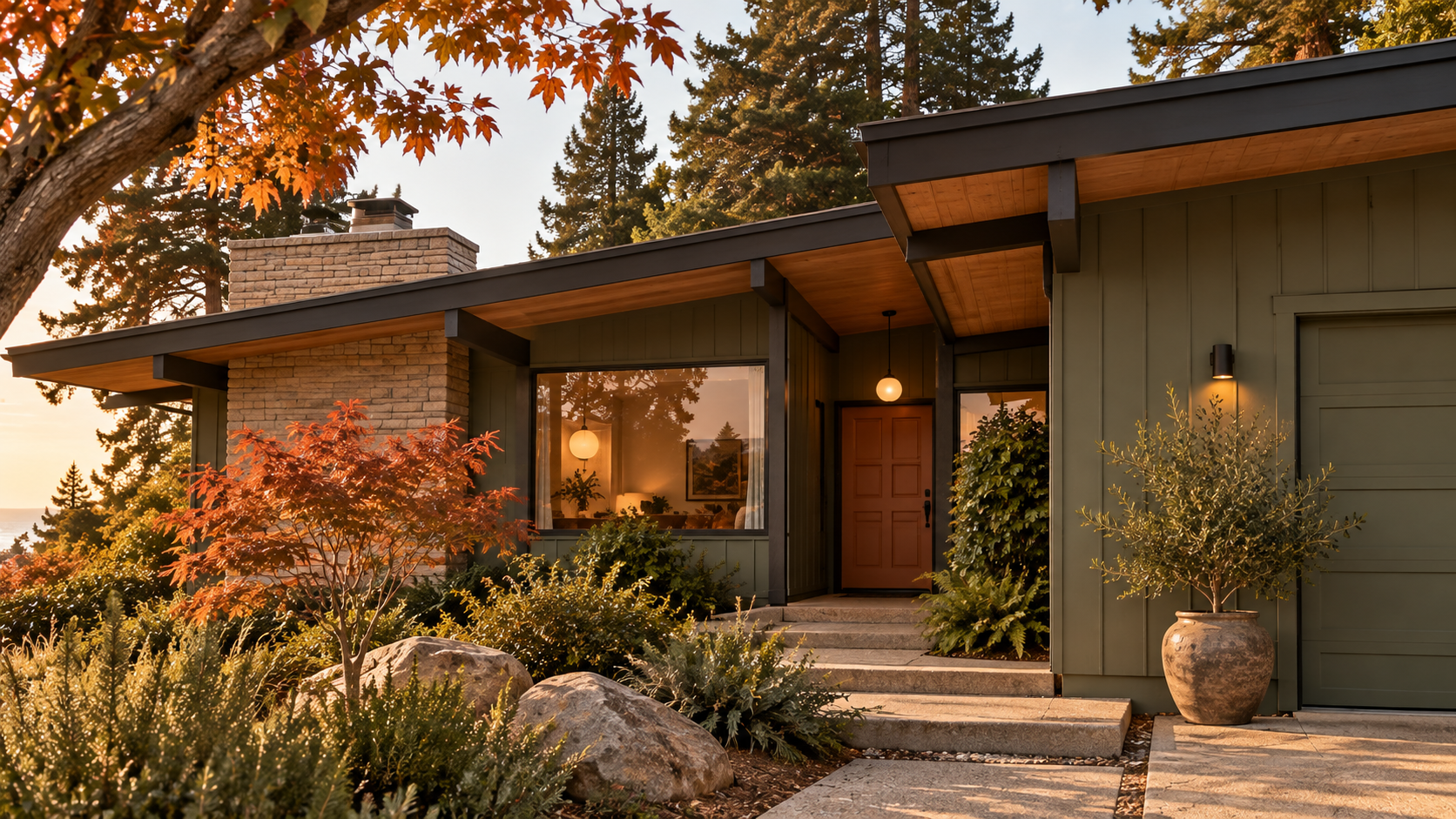
Pair creamy walls with darker doors, cabinetry, fixtures, or accent areas. Add natural wood tones for warmth and texture. Deep charcoal shades such as Iron Ore can provide just enough contrast to make lighter neutral colors stand out.
The result is a layered, intentional space rather than one that feels flat.
5. Always Test Before You Commit
Never choose your final paint color based solely on a small paint chip or an image online.
Test larger samples directly in the space you're painting and live with them for a few days. Look at the colors in morning light, afternoon sunlight, cloudy conditions, and after dark with your home's lights turned on.
A little extra time during color selection can prevent an expensive repaint later.
Warm Neutrals Are Timeless for a Reason
Trends will continue to change, but a thoughtfully chosen neutral palette provides a beautiful foundation that can evolve with your home.
Furniture can change. Artwork can change. Décor and finishes can change. A well-selected neutral gives you the flexibility to update everything around it without needing to repaint every time your style evolves.
For Santa Cruz and coastal California homes in particular, warm neutrals pair beautifully with natural wood, stone, linen, leather, greenery, and the relaxed indoor-outdoor style our area is known for.
Ready to Refresh Your Home?
If you're considering an interior repaint but aren't sure which shade is right for your space, Modern Bay Painting can help you narrow down your options and create a finished palette that works with your home's lighting, architecture, and existing finishes.
From detailed preparation to the final coat, our goal is a beautiful, professional finish you'll enjoy for years to come.
Modern Bay Painting Santa Cruz, California Professional Interior & Exterior Painting
Ready for a fresh look? Contact Modern Bay Painting to request an estimate for your next painting project.